.avif)

Refresh Your Dining Room: The Best Paint Colors
Color is an essential factor that influences how your space feels and really pulls toegther thr design of your room. Choosing a color that will enhance the mood you want to go for is key, but also a challenge because the choices are endless.
But don't fret. We spoke to a ranger of interior design and interior paint color experts to pull toegther the best living room paint color ideas.
The Best Living Room Paint Colors: 35 Designer Picks
White color pics
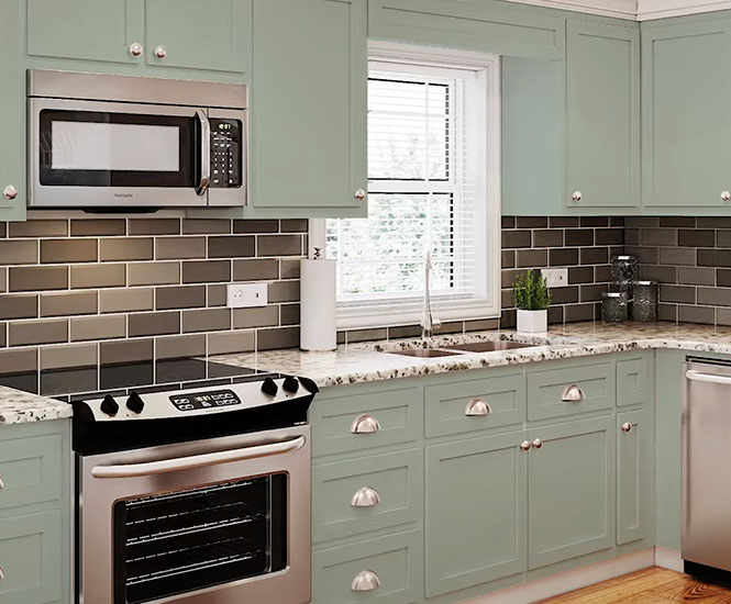
White is one of the most traditional living room paint color choices. Crisp white walls are classic, simple, and clean. It creates a calming atmosphere and can be offset beautifully with eye-catching furniture pieces or accent colors. White was are especially good a small space and makes a space feel clean and modern.
Cricket White
Cricket White is a cool color developed by a heavyweight in the American paint industry C2Paint. It contains white and beige pigments and is a full-bodied shade.
Why it's a go-to color for many interior designers:
"For those trying to escape grayish tones, it’s also a perfect choice. It also plays well with light and shadows, so no matter which direction your house faces, it looks fantastic."
Architectural White

Architectural White is a popular white paint that has been used for years. Our ereviewer nostalgically shares her thoughts on the color:
"Architectural White from C2Paint remains not just a classic and historically top-selling color for the brand, but the most used in Beam designs overall,”.
Linen

Cool Moon is a cool, crisp, off-white paint that can invigorate any family room. White is elegant and always in style, making it one of the most popular paint colors for living room walls.
It is perfect for both warm and colder climates. This simple white paint works as the perfect backdrop to any design and color scheme you might choose.
Linen

Like its name suggests, Linen is a off white paint that is meant to be as smooth as whipped cream on your living room walls. It is a great color for rooms facing north. It is an adaptable shade that works well with various architectural elements.
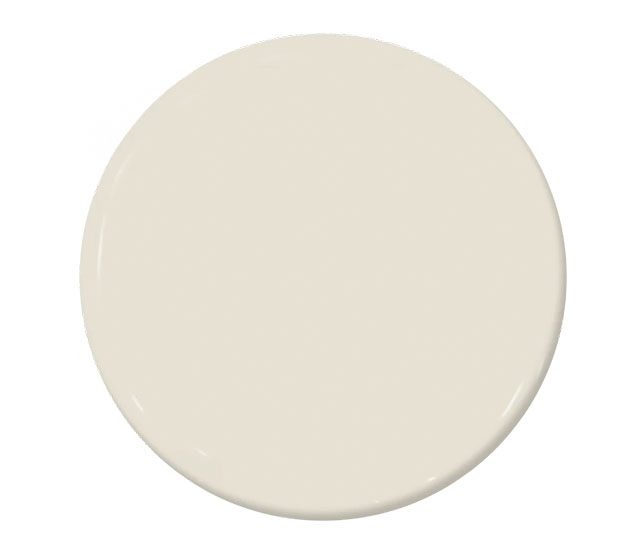
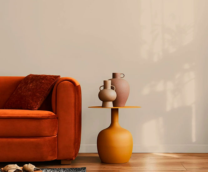
Cream and Beige Color Picks
These two neutral paint colors can transform any space into a tranquil oasis. These lighter, almost taupe shades create a welcoming, spacious and relaxed atmosphere to any living room design.
Harvest Moon

The Harvest Moon paint color from Back Drop is a light beige that contains inviting yellow pigments. It can complement warm off-white and gray paints quite well.
Halo Paint Color

Halo is a creamy off-white paint color often used for living rooms. It contains warm apricot notes that brighten up any home. Maryna Liashenko features this color at home herself:
“I have C2Paint Halo in my living room and it is the perfect warm white. It looks great with all the wall paneling".
Scalloped Shell

This is a warm off-white paint color that transforms any room into a sanctuary for deep rest. “Scalloped Shell has a soft and warm neutral tone that is easy to adapt to any atmosphere and design aesthetic,” explains Karen Rohr.
Beach Beige
This light beige paint color from Evolve and has warm undertones and will look excellent for living rooms.
Kind Paint color
This off-while paint from All-In-One-Paint comes with hints of buttery yellow. It is a feast for the eyes and is similar to the Sugar Cookie shade. This hue is ideal for north-facing rooms as it neutralizes the incoming light.
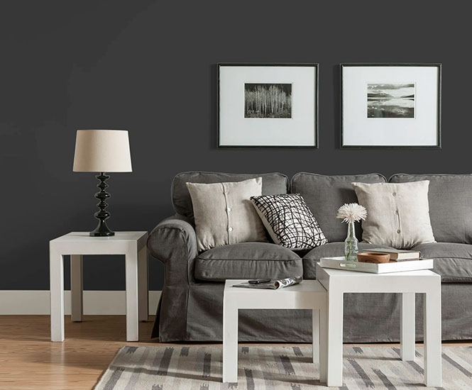
Black Color Picks
Darker shades help to add a touch of elegance to any space. Black compliments a lot of colors and it makes a room seem more spacious. It also distributes light beautifully. However, remember to use black in a space that has many windows as you don't have a room that feels claustrophobic.
Black Eggshell Wall Paint
Black Eggshell is a classic black paint color that adds class and elegance to any living room. “I love Tricorn Black from Glidden behind the tv on the wall so I don't have to see the giant black screen,” Jennifer Guerin adds.
Warm Black

Warm Black by All-In-One-Paint can be used as interior and exterior paint. It isn't as dark as true black but works wonderfully as a backdrop color in any room.
Brigand

This dark shade is slightly lighter than black paint and has a tinge of violet mixed in.
After hours

This is a light charcoal-colored paint that adds warmth and a sense of depth to any living room wall.
Gray Color Picks
Gray is a versatile color. A darker shade can add warmth to a living room whereas a light, cool gray can make a small seem more spacious. Gray is excellent for homeowners who prefer a minimalist color palette. They can jazz up their spaces further with bold decorative accessories that help accentuate walls painted pure white.
Glidden Quick Cover

This is a white and pastel paint color from Glidden. It contains specs of twilight intermixed with lavender and is one of the market's most popular light gray paint options. Karen Rohr adds: “Quick Cover is a bit cooler, perfect for keeping the room white and airy but opens up the space to make it feel larger”.
Italian Plaster

This is a lighter gray paint containing elements of blue. It pairs wonderfully with pure white and darker gray tones.
Eggshell Enamel

Eggshell Enamel is a dark gray paint color that contains elements of indigo. It is a more saturated color that pairs well with true white and off-white colors. Karen Billman says Egghell Enamel is one of her go-to colors: “I’m in the middle of renovating a small living room for one of my clients and we chose Egghell Enamel by Behr for an accent wall."
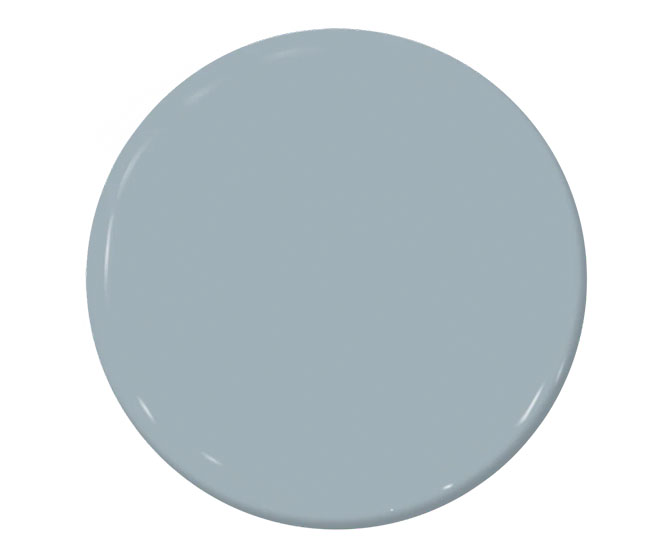
London (green-gray)
London is a bit of an interchangeable color. It is neither blue, gray, nor green. It changes color depending on the angle of the light it gets. “London is one of the neutrals that will slightly add some kind of a cooler tone to the space, perfect to open it up and make it feel larger,” feels Karen Rohr.
Tailored - C2-958

Tailored is a mix between beige and gray. This rich shade can add cool tones to a room that already has depth or add warmth to a space that sorely needs it. This is one of the colors of the year in 2025.
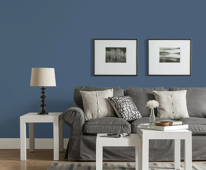
Blue and Navy Color Picks
Blue walls exude a sense of serenity and peace. Blue also adds a cooling effect to a room. It tends to be a flexible color that can work with most home decor styles or funiture colors, so whether you go for a deep blue, navy blue or lighter shade, it should work well with your existing furniture.
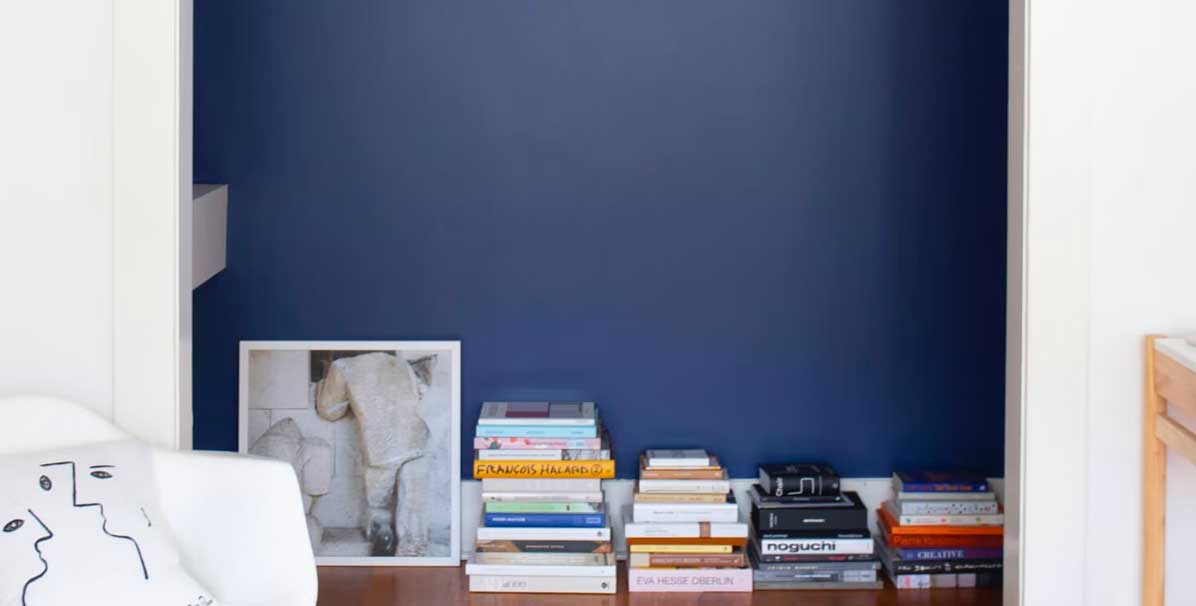
Blue Eggshell
Blue Eggshell by Glidden is a darker shade of blue that is closest to black. This color is velvety in texture and has gray undertones. Karen Billman talks about why this navy blue is so popular among interior designers and architects: "It works very well with darker wood baseboards and white paint and provides an elegant backdrop which allows bold prints to stand out."
The Early Stuff
This is a cooler blue color that contains a hint of gray. The Early Stuff is a perfect baby blue hue that adds an immediate air of crispness to any space.
Blue Square
Blue Square by Behr instantly brings life to any room or accent wall. Splashing a medium shade of blue like this on your living room wall will add a sense of serenity and peace to your space.
Argyle
Argyle by C2Paint is a light blue shade that can be paired with grays to give any living room a burst of color inspiration. "This is one of the colors I like to call ‘unusual’ neutrals; that's because it is still a muted tone but enough to create an impact in the space and add more personality,” adds Mackenzie Collier's Interior Designer, Karen Rohr.
Formentera
This paint has a royal blue tone to it and this hue of blue helps to reflect light proportionally in a room. Formentera adds space to smaller rooms and makes larger rooms feel more intimate.
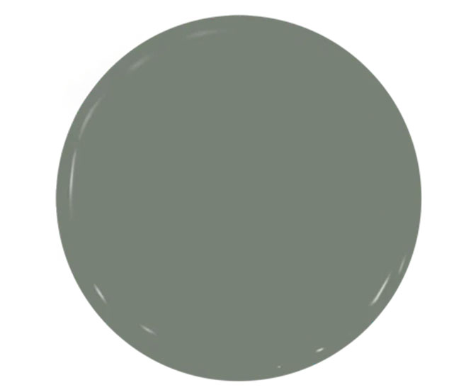
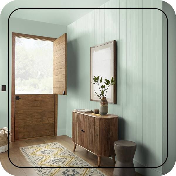
Green Color Picks
Green is a bold color used to promote creativity and improve productivity in a living space. It has a soothing effect when used inside and outside the home as well as on living room walls.
"Many designers are using green as a neutral in their designs, working within a wide range of greens from deep forest greens or olive to cooler minty shades,” says Overstock style director Amber Dunford.
Stream
If you are looking for a shade that is a cross between yellow and green then Stream by C2Paint is your best bet. It is a neutral cool tone that can be paired with neutral furniture. "With the popularity of green in full throttle, we love this color because it’s rarely too dark in a room, which can be trepidatious for homeowners," says Jennifer Walter.
Drive Thru Safari

This shade of green is not quite as light as muted olive green but not as dark as deep green. It gives you a happy medium between the two colors, and has soft and warm notes to it.
Moss Ring

Glidden's Moss Ring color gives you the feeling that you are in a foliage-covered forest; green walls give off the sense of being in nature. It blends wonderfully with less saturated colors and comes highly recommended by Ashley Daubert.
Jade Tinge Eggshell
This is a cool paint color that contains blue and green pigments. It blends well with creamy white colored design features. “Jade Tinge Eggshell adds more color for those who want to keep the space neutral but are looking to incorporate slightly more color without compromising too much,” says Karen Rohr.
Cucumber

Cucumber is a light olive/almost sage green paint and can be used to add a pop of class to any living room space.
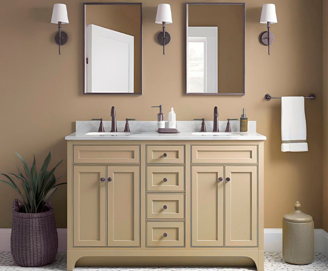
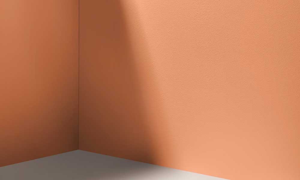
Peach, Clay and Terracotta Color Picks
These warm tones give any living room color scheme a welcoming and vibrant feel. They work well with natural light and can be paired with gold and green to spruce up a living room.
Interior designer Ashley Daubert adds: "I’m seeing a lot of warmer colors trending like ochre, terracottas, and caramel browns.”
Cool Clay

A sandy taupe shade like this is very versatile and quite popular right now. Cool Clay - a great option for north-facing rooms and comes highly rated by interior designer Ashley Daubert.
36 Hours In Marrakesh
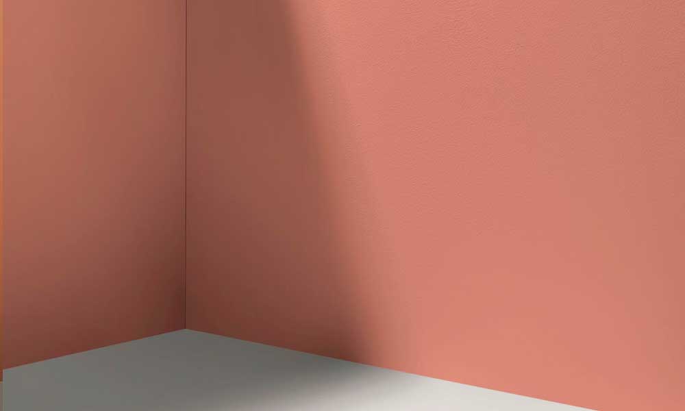
This paint shade is a warm, earthy pink. A coat of this on your living room walls will transport you to the bustling markets of Marrakesh!
Champagne Bonfire

This is a very sandy and light peach color. It will leave any living room feeling bright and airy.
Legendary Satin

With Legendary Satin, you are getting a purple hue of paint. It is both neutral and warm, and it comes highly rated by Ashley Daubert who thinks it is a suitable color for almost any room in the house.
Aperitivo Hour
Add this shade to your color palette if earthy dark peach is what you're looking for. This color adds depth and an air of sophistication to any living room.