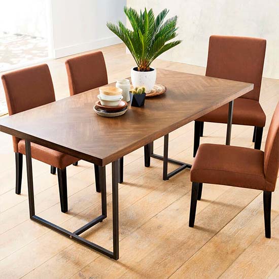
The Complete Guide to Dining Table Styles
And given how much visual space your walls take up, the wall paint color you choose for your dining area can help set the entire tone for each and every meal.
“Colors heighten different sensations, so picking the right one will create the appropriate dining experience for family and guests,” says Jennifer Guerin of JG Color Studios. And different colors evoke different feelings, so you can intentionally choose a hue that aligns with the ambiance and mood you’re seeking.
But the right color for your dining area really depends on your unique preferences and needs. From soothing wall paint colors that instill a sense of calm to energizing hues that will uplift all your meals, here are the best dining room paint colors for every need and aesthetic.
What Paint Colors Work Well in Dining rooms?
While you can paint your dining room virtually any color imaginable, certain hues lend themselves to this space better than others. For instance, if you want to create a moody or dramatic ambiance, then deep rich hues, like jewel tones, are a great fit. Meanwhile, lighter hues, like whites and pale pinks, lend themselves to brighter, more casual atmospheres.
“There are a few different shades that work especially well for dining rooms depending on the atmosphere you are trying to create. Deep blues can be very impactful in a space, soft neutrals offer a brighter look, and warm off-whites provide a calmer vibe.”
The right choice for you depends on the vibe that you’re after. According to Natalie, “There are a few different shades that work especially well for dining rooms depending on the atmosphere you are trying to create. Deep blues can be very impactful in a space, soft neutrals offer a brighter look, and warm off-whites provide a calmer vibe.”
8 Dining Room Paint Color Ideas Curated by the Pros
1. Gray-beige
Gray-beige, aka “greige”, is a versatile hue with a knack for adding warmth and sophistication to a space. And thanks to its versatility, the color lends itself to a wide variety of aesthetics and color palettes, so it’s easy to incorporate into most looks.
Color Inspiration: Interior Motives

If you like the warmth of greige, then you’ll love Interior Motives by Backdrop. “Interior Motives is a great choice for someone who wants a soft and bright space that’s more elevated,” recommends Natalie Ebel.
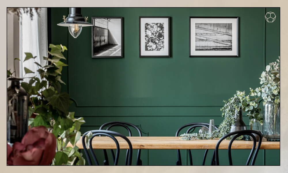
2. Green
Green is another versatile hue that, according to Jennifer Guerin, can be more moody or casual depending on the tone and shade you choose: “There are a variety of colors that can work in a dining space, but deciding on the tone and shade is where you can really make an impact. Using green as an example, picking a light or dark will depend on your style of home and way of living. Formal dining rooms are a good place to try something moody.”
Paint Pick: Salamander

Speaking of moody, C2 Paint’s Cypress is a rich, saturated green hue that will add just the right amount of drama to your aesthetic without leaning too bold or bright. According to Jennifer Guerin, “C2 Paint's Cypress is a great color to add some depth.” You can use it sparingly as an accent wall or paint your whole dining room for a more dramatic effect.
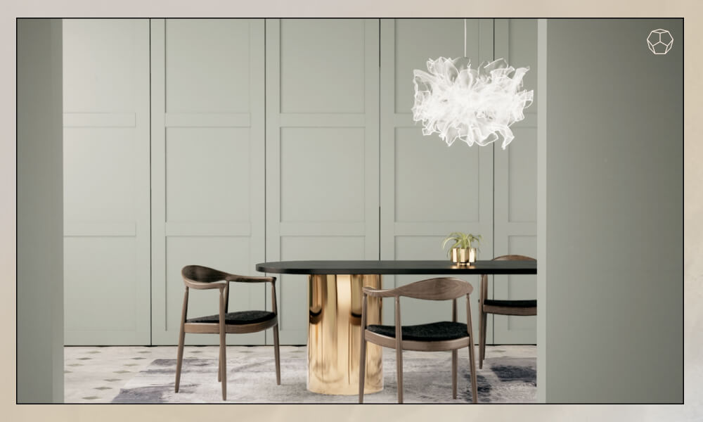
Discover the refined elegance of London - a sophisticated fusion of muted green and soft gray that brings depth, calm, and understated luxury to your dining space. This distinctive hue creates a serene yet stylish backdrop that complements both traditional and modern interiors. With All-In-One Paint, transforming your dining room has never been easier: just Clean & Paint - no sanding, priming, or sealing required.
Color Inspiration: Urban Nature

Looking for something lighter? “If your home is more casual, you may want to try a more soft and muted color,” recommends Jennifer. “Serendipity is the perfect green for a farmhouse or country chic dining room.” It can also work well to elevate boho and mid-century modern dining rooms.
3. Pure White

Choosing white paint for your dining room walls will help reflect artificial and natural light, making your space feel brighter, lighter, and bigger. This makes it a particularly great fit for small spaces, but white wall paint works well in dining areas of all sizes. White is also among the most versatile wall paint colors around, so you can make it work regardless of your interior design’s color scheme.
Color Inspiration: Supermoon

Contrary to popular belief, white comes in many different tones and shades, but we’re especially fond of Supermoon from Backdrop. “Supermoon is a pure white and one of our bestselling colors. It’s a simple solution for someone looking for a clear and calm dining space. It doesn’t have any cool undertones, so it’s easy to build around, while friendly enough to stand on its own,” says Natalie Ebel.
4. Pale Pink or Dusty Rose
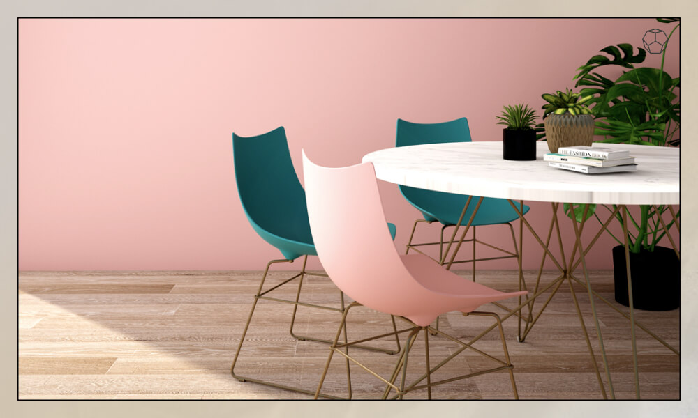
Want to add some happy-making color to your space without overwhelming it? Then consider a pale pink or dusty rose, both of which have been major color trends in recent seasons. “To keep things, light, bright, and airy, try bringing in refreshing, playful hues that have a welcoming feeling to them to make family and friends feel at home when they sit down for a meal,” recommends Thomas Hill. “Well known for its flattering qualities, pale pinks and dusty rose colors are great options.”
Whether you’re looking for subtle pale pink or something a bit darker and richer, Thomas recommends these pink hues for an elevated dining room design:
Color Inspiration: Foggy Morning

For a lighter pink wall color, Thomas Hill recommends Secret by C2Paint, which is quite neutral but will still add a touch of playful color to your dining area.
Color Inspiration: Rose Silk

If you’re looking for something a little darker and richer, consider C2Paint’s Helium, which has a warm, almost ethereal quality that will help you create a dynamic and welcoming dining room design.
5. Deep Blue

Deep blue is among the best paint colors for dining rooms and beyond because it serves just as well as a neutral backdrop as it does a bolder statement color, depending on the rest of your home decor. It’s also incredibly calming, making for relaxing meals with loved ones.
Color Inspiration: Surf Camp
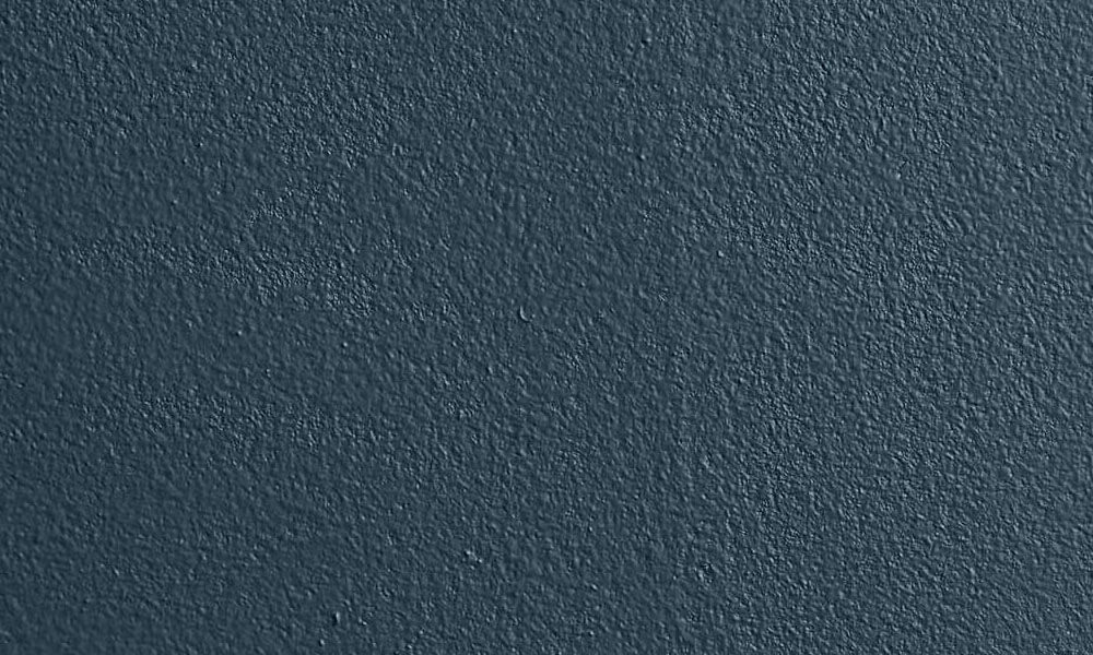
Backdrop’s Surf Camp really maximizes the versatility of deep blue hues. “Surf Camp is a deep blue with green undertones,” says Natalie Ebel. “It changes depending on the space and light, and is very natural with the potential to be formal.”
6. Deep Jewel Tones
Deep jewel tones, like emerald, sapphire, and amethyst, are timeless hues that can set the tone for many celebrations to come, adding chic contrasts to your look. “Dining rooms are often dedicated to celebrating and entertaining, and they’re not used as much as living rooms or kitchens. It is a great opportunity to bring in colors with a little more contrast to the rest of your home’s palette.”
For decadent, saturated jewel tones that create a dramatic but still sophisticated look, Thomas Hill shared three color picks. These hues work particularly well with color palettes comprising cool grays and grounded neutrals.
Color Inspiration: Dinner Party

Turkish Market by C2Paint is a deep red with black undertones that will make a big splash in any dining room look, energizing the space while adding compelling depth to your color scheme.
Color Inspiration: Beau Green

Capri by All-in-one Paint strikes a beautiful balance between soothing and inspiring. The hue will make your space feel grounded and calm with a hint of energy that will invite cozy conversations with friends and family.
7. Light Blue and Green Hues
Light blues and greens can make your space feel lighter and brighter while infusing it with peace and tranquility. Reminiscent of the ocean, these hues are particularly great fits for coastal aesthetics, but they also lend themselves well to farmhouse, contemporary, and modern looks.
For more of a coastal, relaxed look, Thomas Hill recommends Oxygen or Vapour from C2Paint.
Color Inspiration: Oxygen

Aptly named Oxygen, this C2Paint wall paint color will make you feel like you’re dining alfresco on your favorite harbor. Pair it with bistro dining chairs to complete a coastal-cool look.
Color Inspiration: Hollingsworth Green

If you prefer something more green than blue, then this peaceful sage hue is a stellar option. Equal parts light and sophisticated, it will give your interior design a fresh and elegant flair.
Color Inspiration: Oracle

Speaking of “refreshed”, Oracle Ice is a refreshing, easy-going interior paint color that will add a touch of easy breezy cool to any aesthetic.
8. Charcoal, Brown, and Black
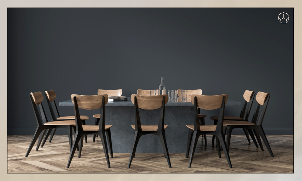
On the hunt for a neutral paint color with a lot of depth? Consider incorporating charcoal, brown, or black. “If you want to bring deeper colors into your home but prefer neutrals and grays as opposed to the more colorful jewel tones, look for peppery charcoals, smokey browns, and midnight black paint colors,” recommends Thomas Hill.
Thomas shared three paint color picks if this is your style:
Color Inspiration: Barnacle

Barnacle from C2Paint is a great fit if you love the richness and saturation of deeper hues, but you don’t want your space to feel too dark.
Color Inspiration: Envy (slate green)

On the other hand, if you’re all about deep, dark, and dramatic, then Envy will give you just that. Consider using it to create an accent wall that can serve as the focal point of your look.
Color Inspiration: Wildwood

Wildwood is sort of like a marriage between the two aforementioned colors. It offers a bit of deep drama, but it’s light enough that it won’t weigh down your look.
eyond the curated selections, you’ll also discover a wide range of high-quality interior paints at major retailers like Walmart and Home Depot - ideal for finding the perfect shade to match your vision and budget.